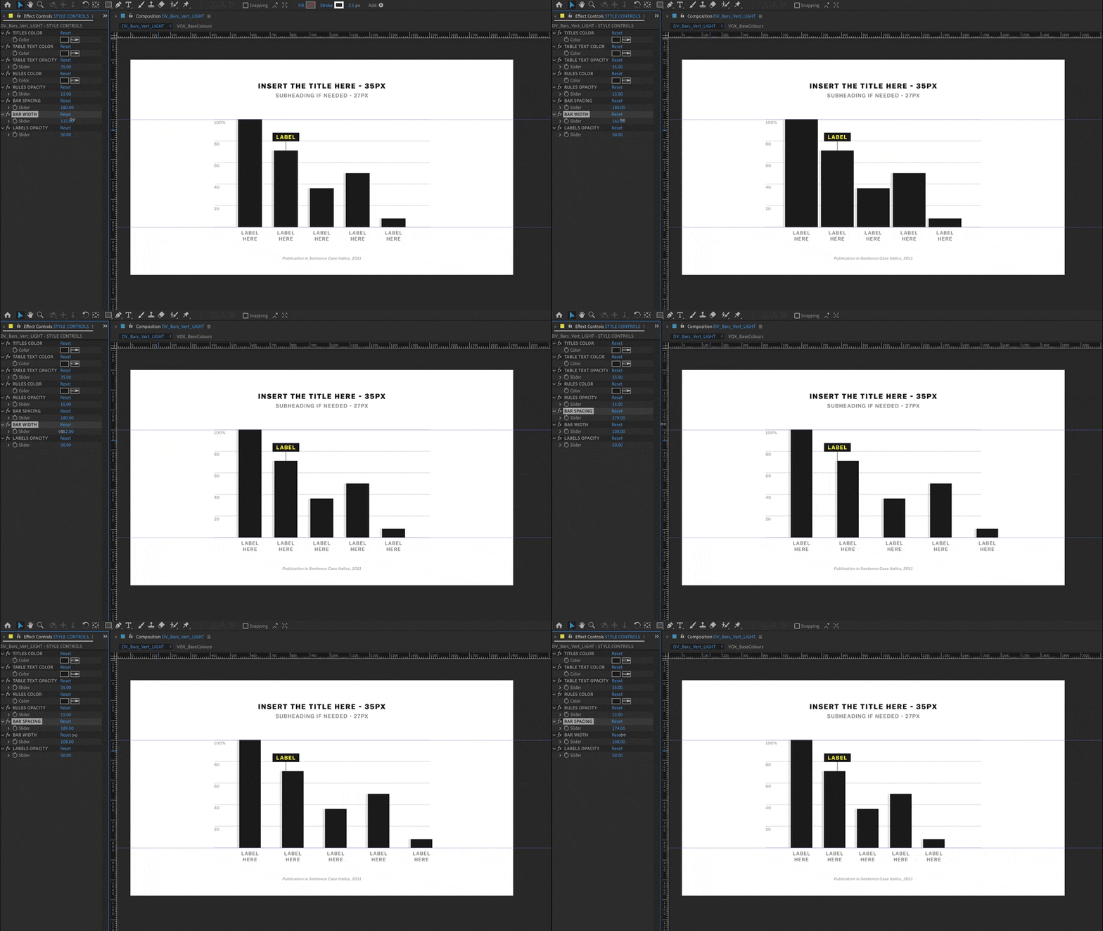
An adjustable bar graph template
I was thrilled to have had the opportunity to serve as the art director for season 3 of Explained. Production began in May of 2020. There were 30 episodes to produce, and only a year and a half-long production schedule! The reduced capacity to shoot film during the pandemic meant that episodes would be leaning on animation more than ever.
My goal for the season was simply to make the best graphics possible under these new working conditions. In order to do that, efficiency would be key. I sought out animators with experience in editorial animation. I then went to work creating reference materials for the GFX team, using an intranet landing page that included links to relevant production tools, a catalogue of past designs, workflow slides, and expression-driven dataviz templates with video tutorials.
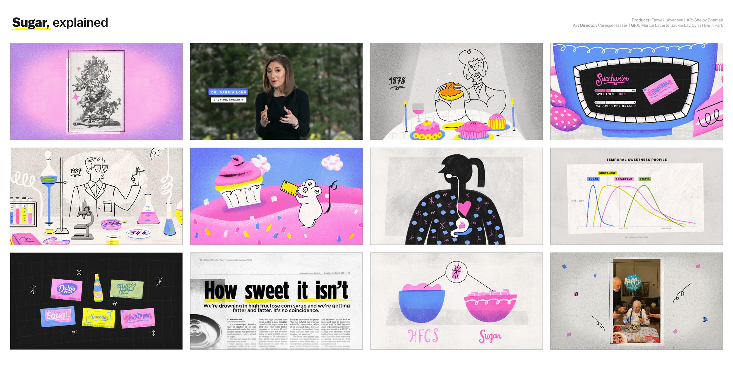
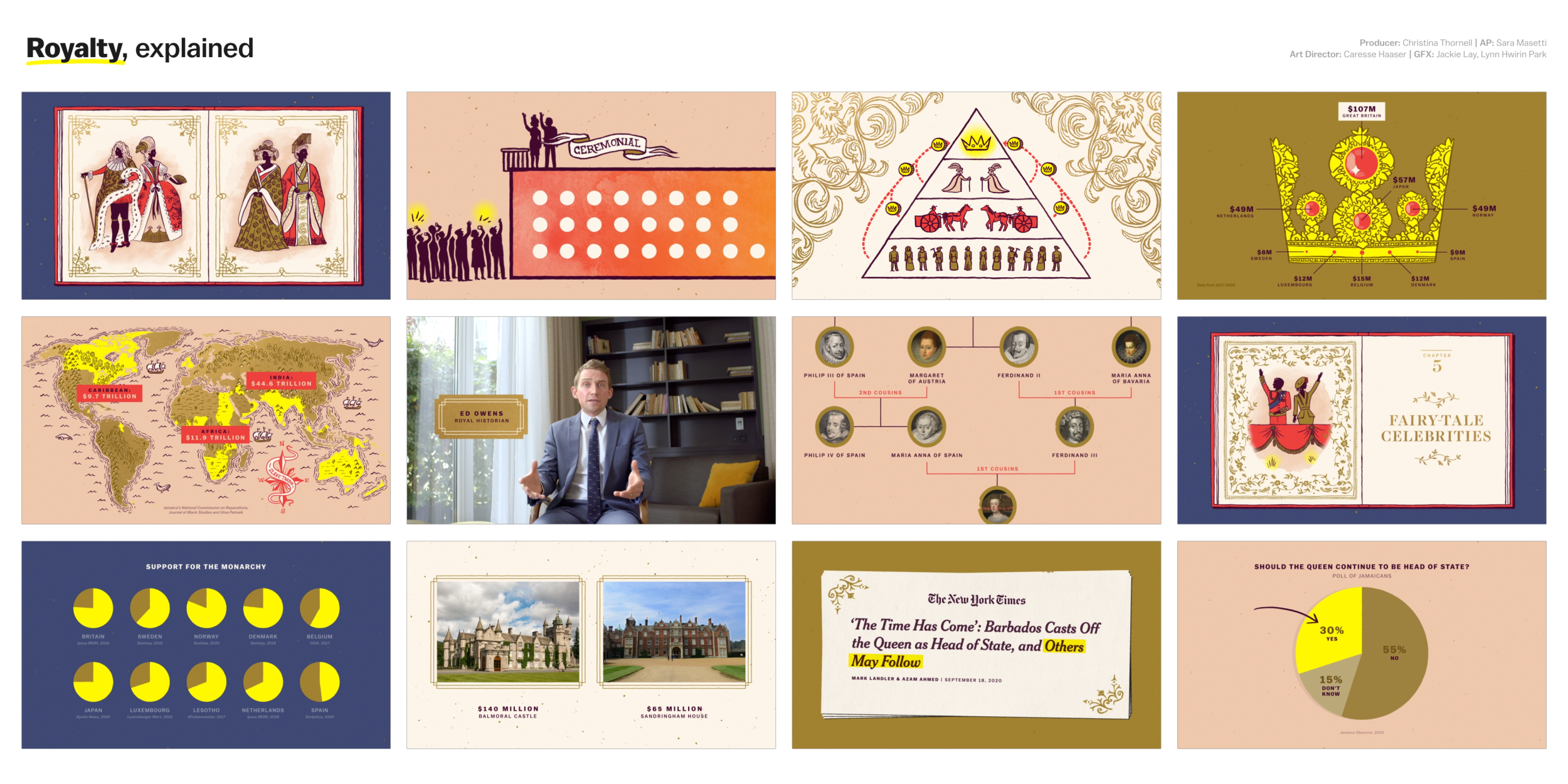
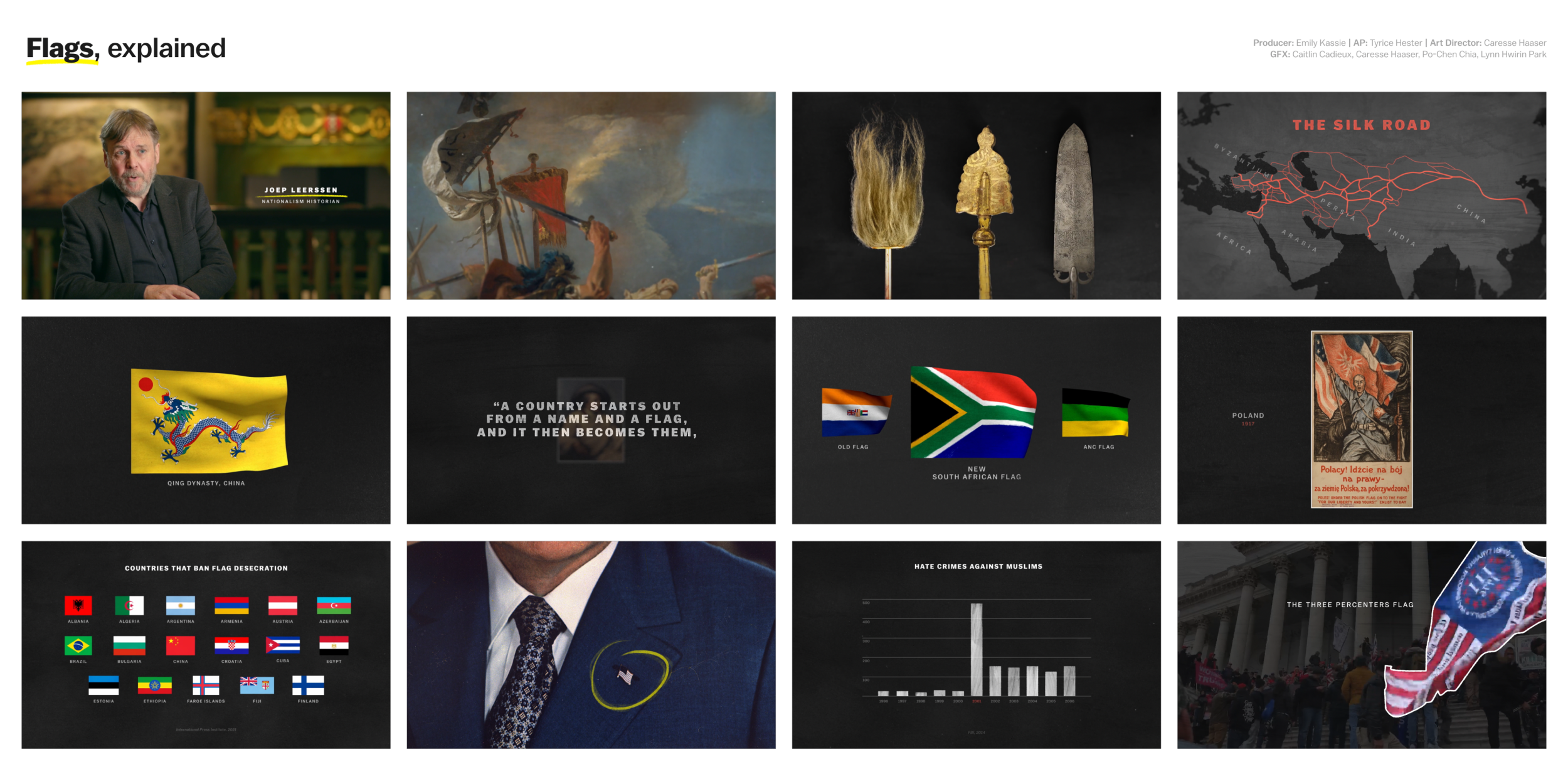
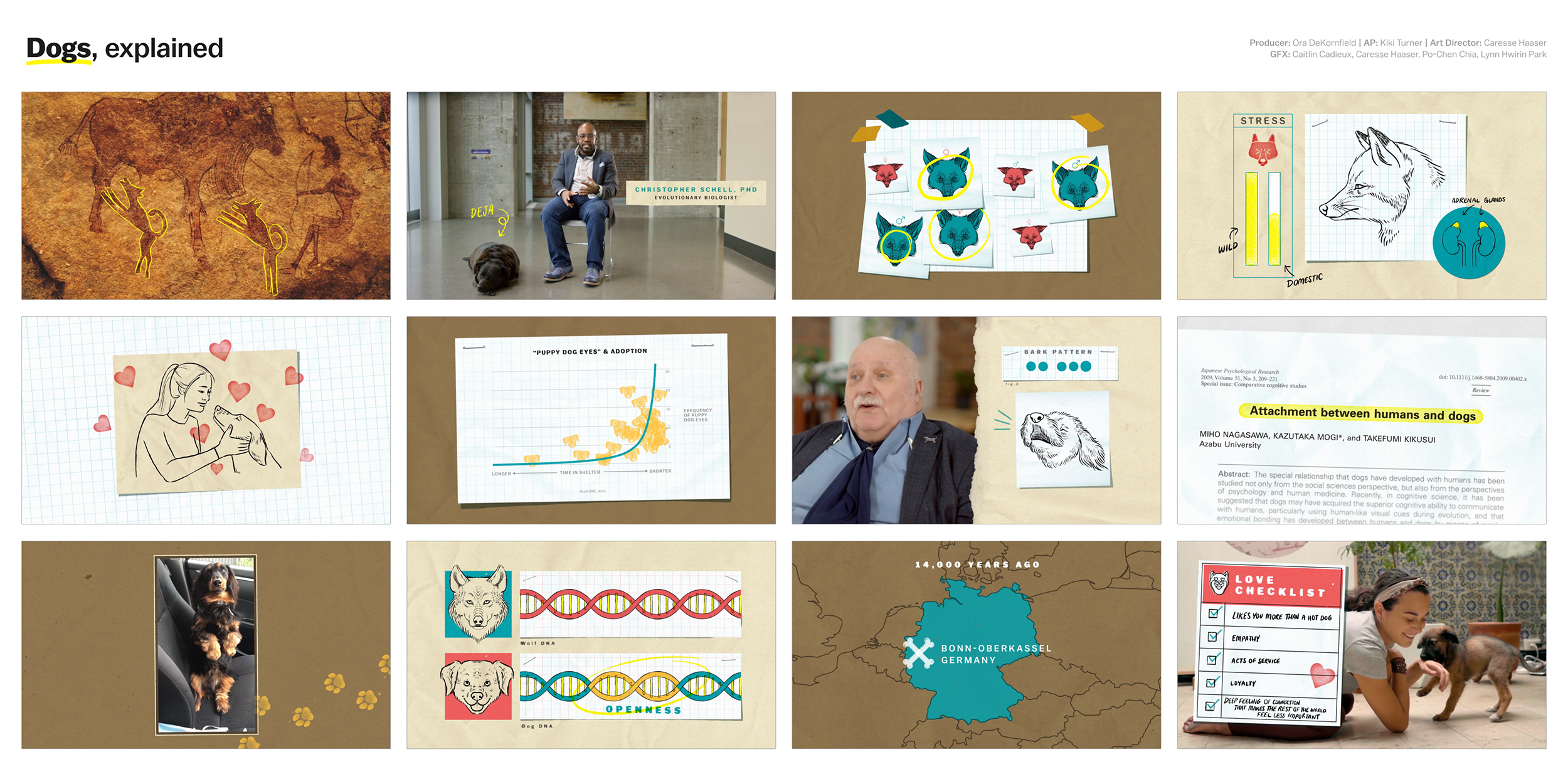
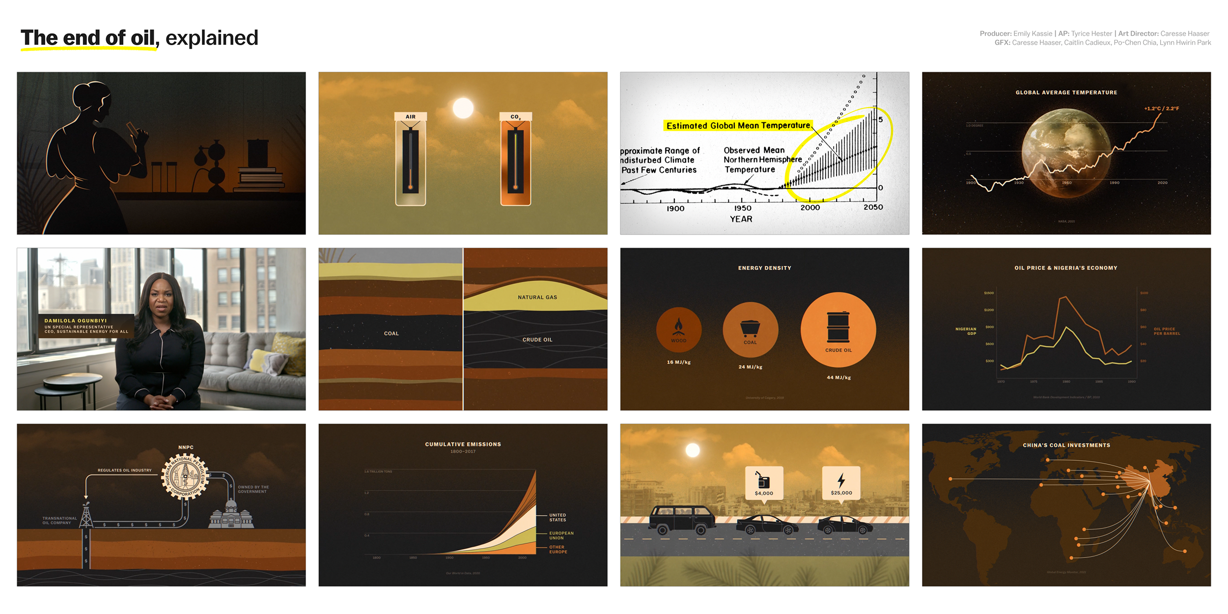
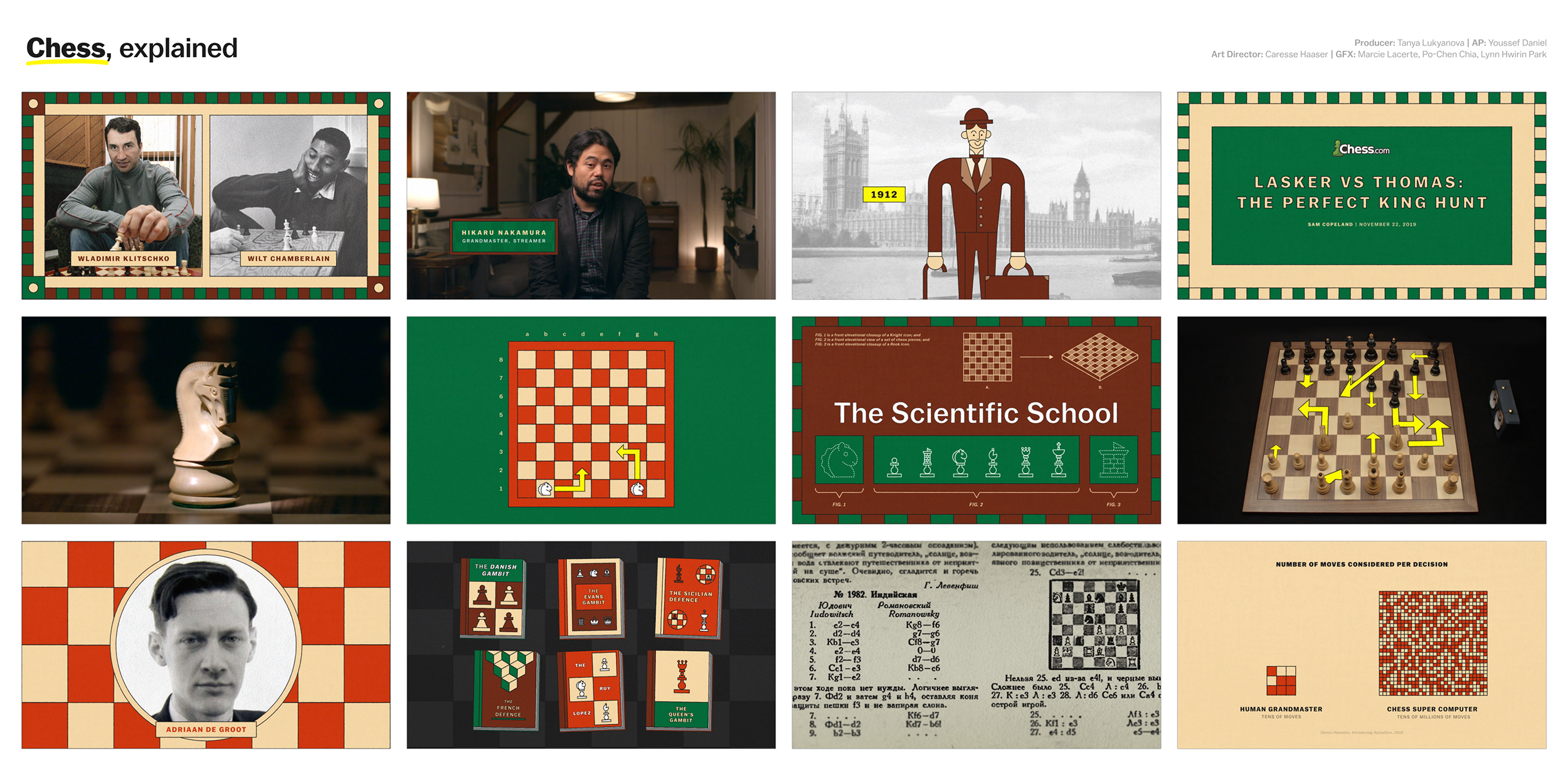
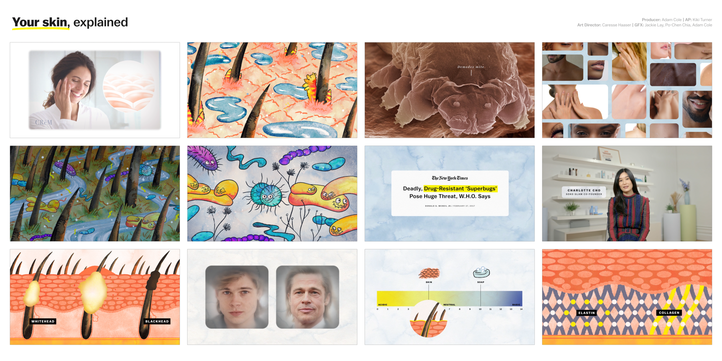
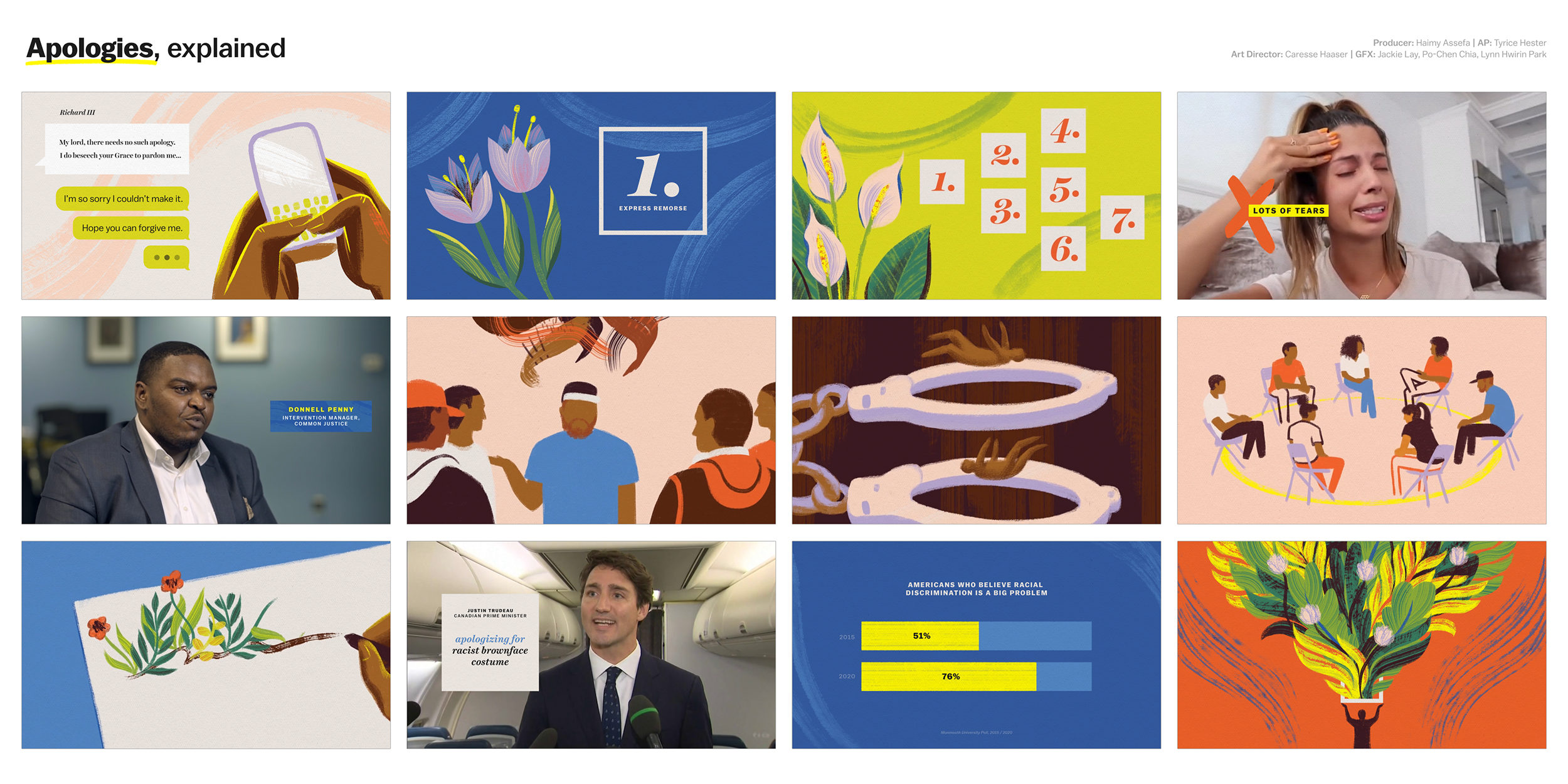
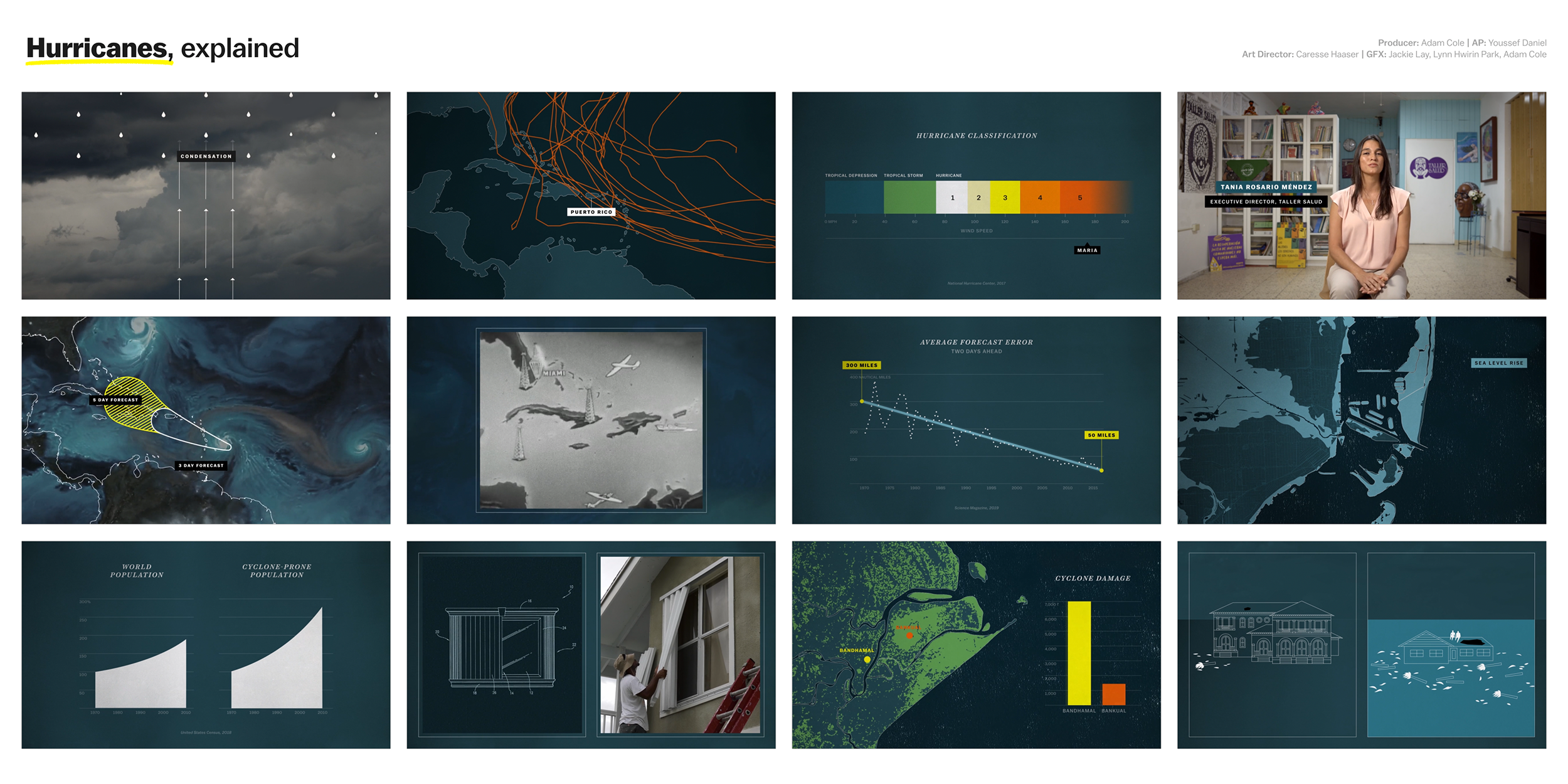
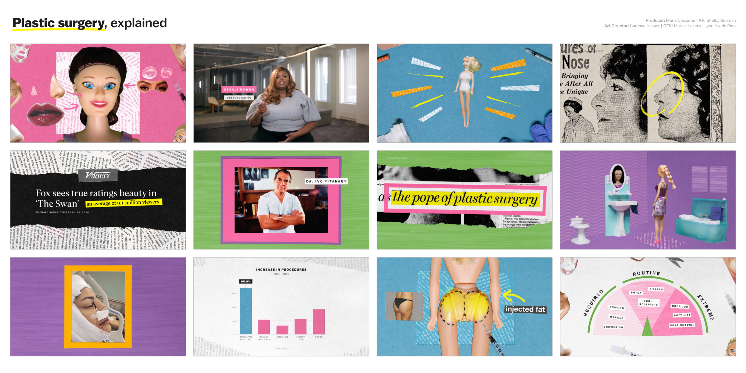
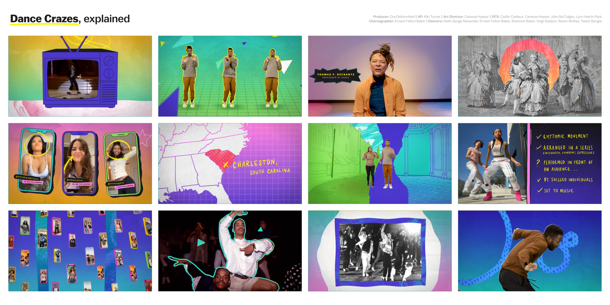
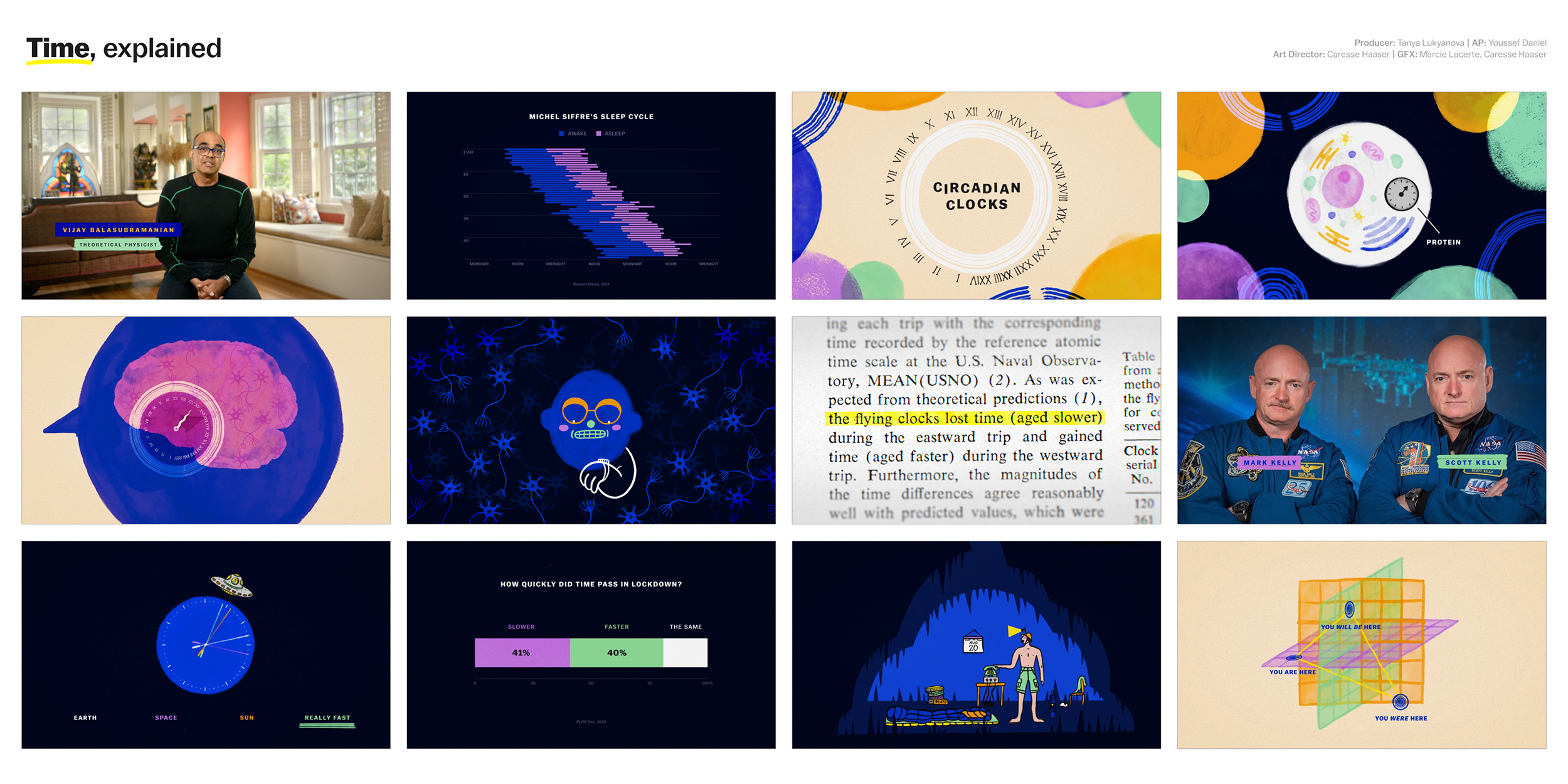
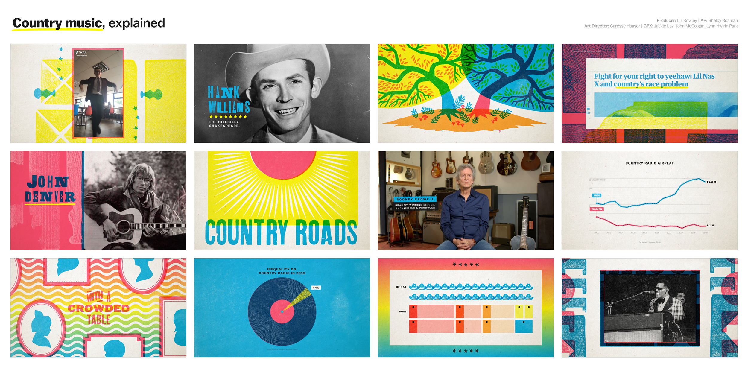
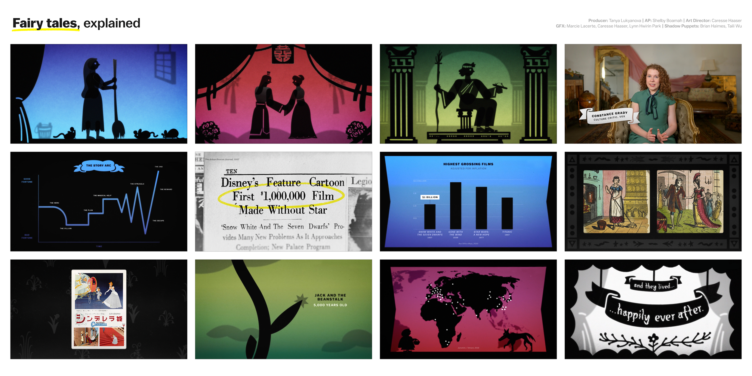
Below are a selection of styleframes from each individual episode. I wanted to use bold color more throughout the series. Not just for moving objects and design elements, but in backgrounds as well, which in the past tended to be more neutral. This wasn’t always achievable or appropriate for all topics—tone and clarity come first. I’m so proud of all of the hard work our team put into this season, and all of the new styles and animation techniques we employed!

