Whose Vote Counts, Explained


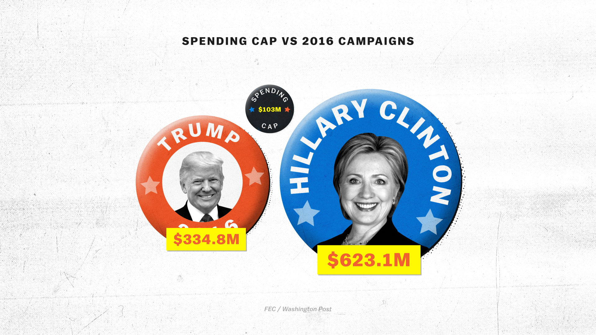
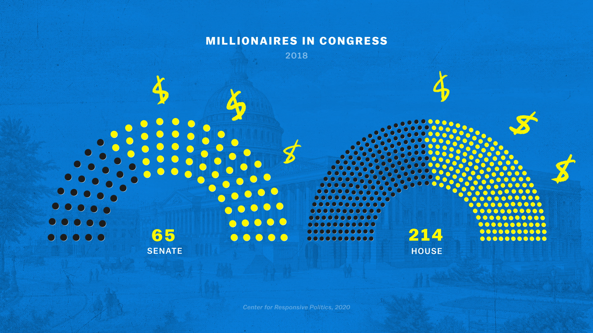
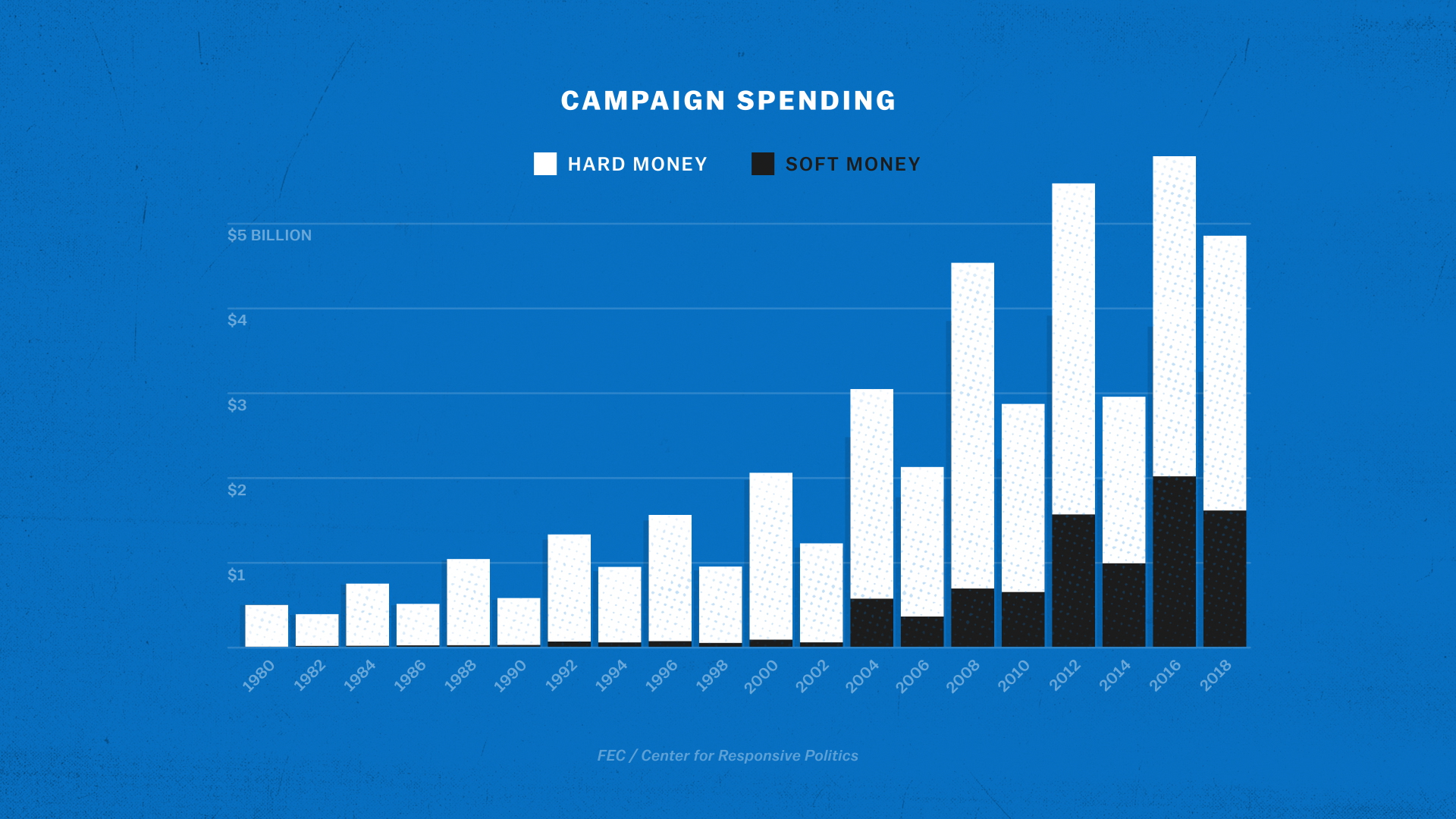
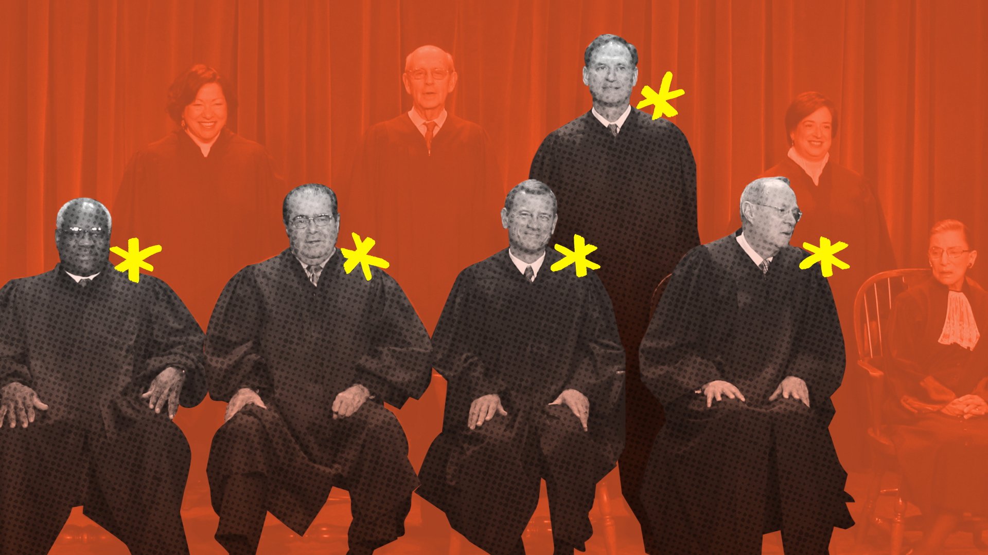
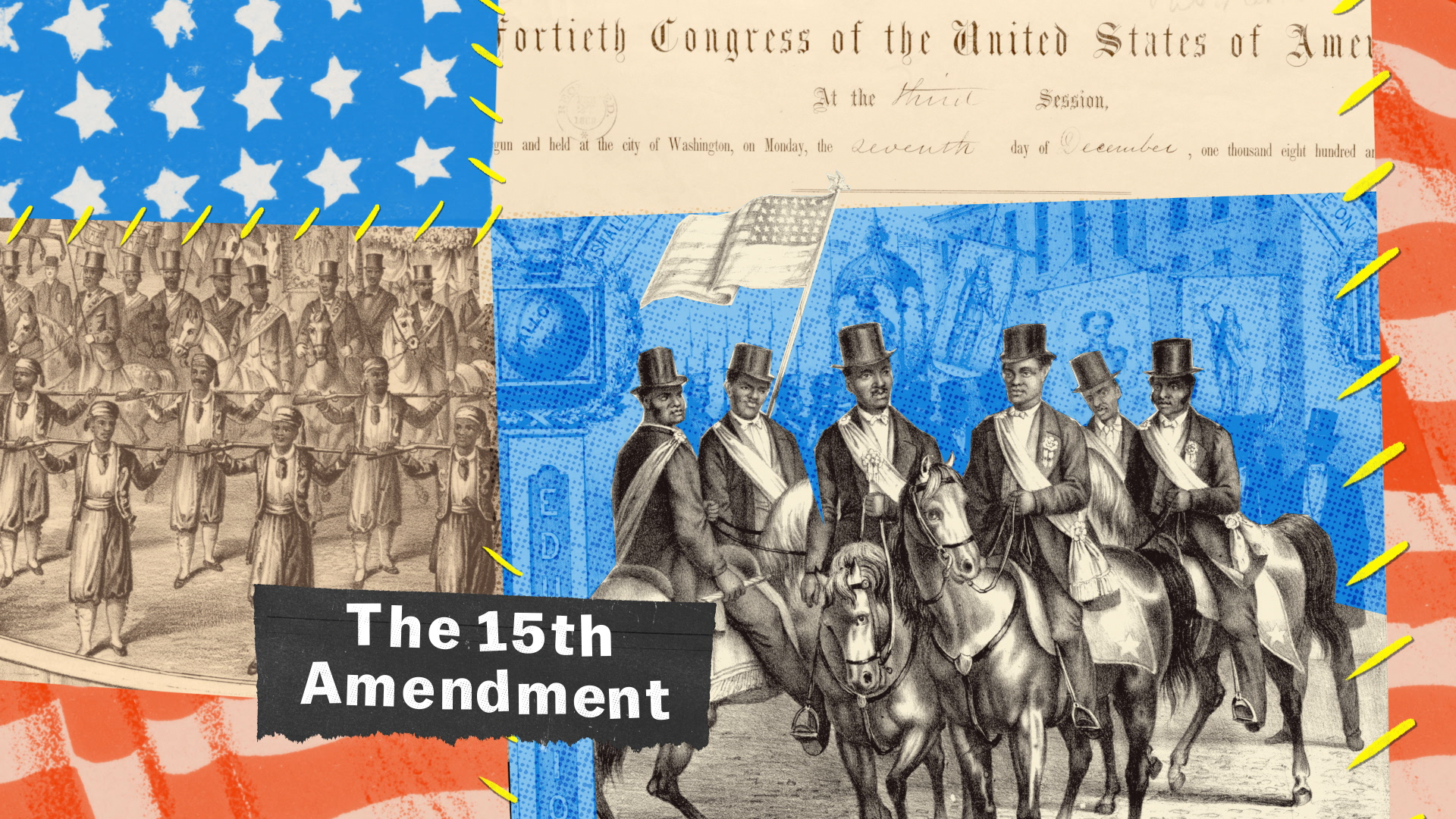
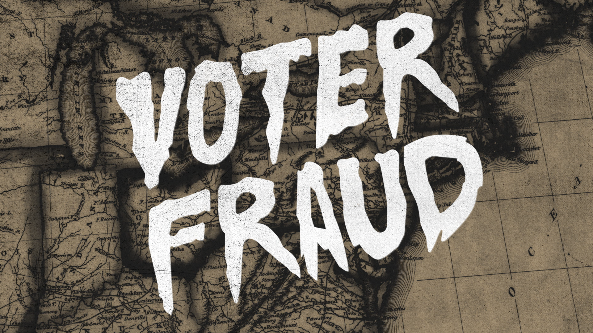
An early styleframe I created. Later designs incorporated a more equal balance of illustrations alongside photographic elements. We discovered that it was sometimes faster to illustrate instead of hunting for the perfect image.
“We all should know that diversity makes for a rich tapestry, and we must understand that all the threads of the tapestry are equal in value no matter what their color.” - Maya Angelou
My first episodes as art director on Explained were a three-part miniseries about US Democracy and its electoral system. These episodes, produced in collaboration with Leonardo DiCaprio, were to air just two months ahead of the 2020 Presidential Election. No pressure!
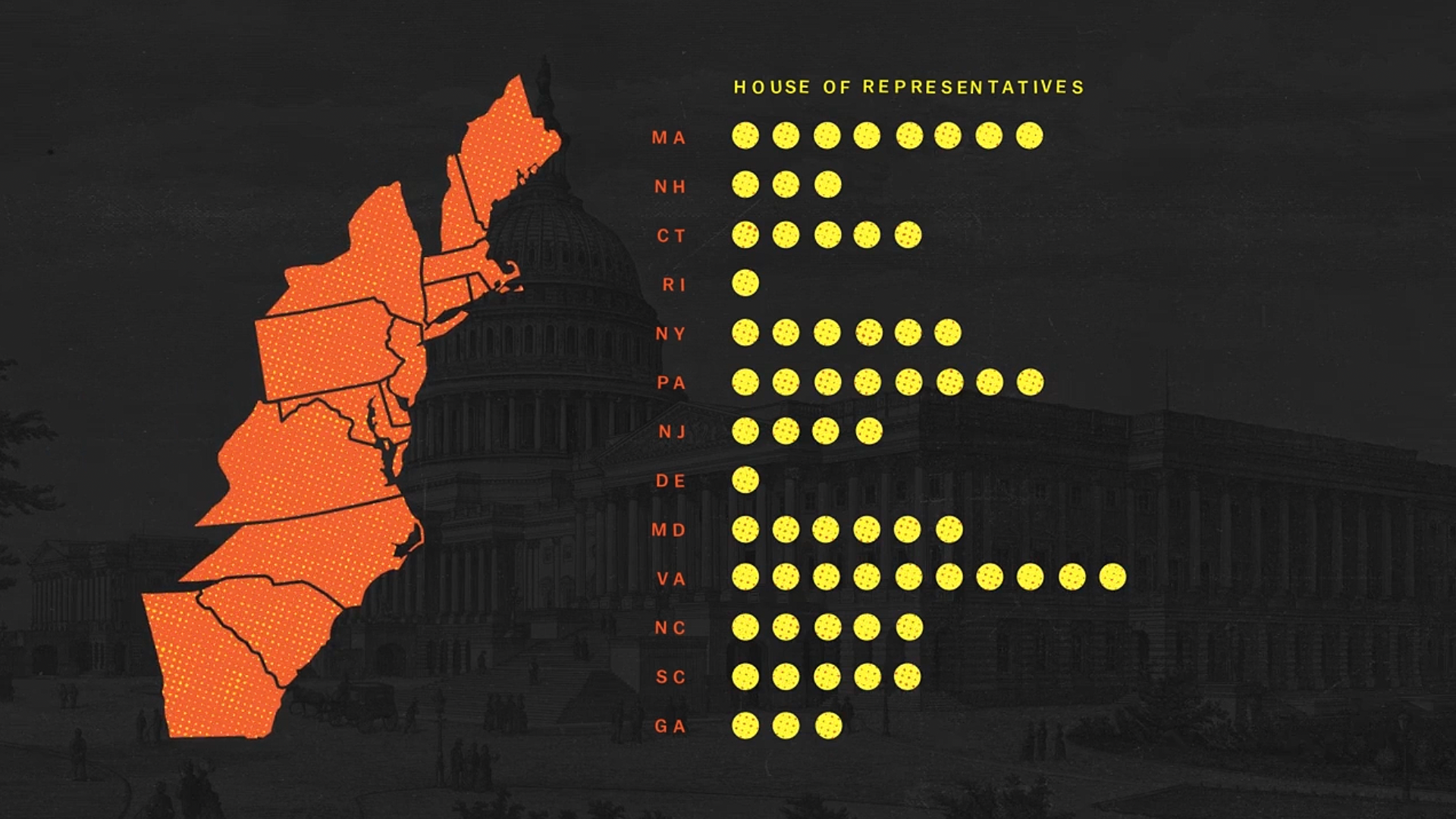
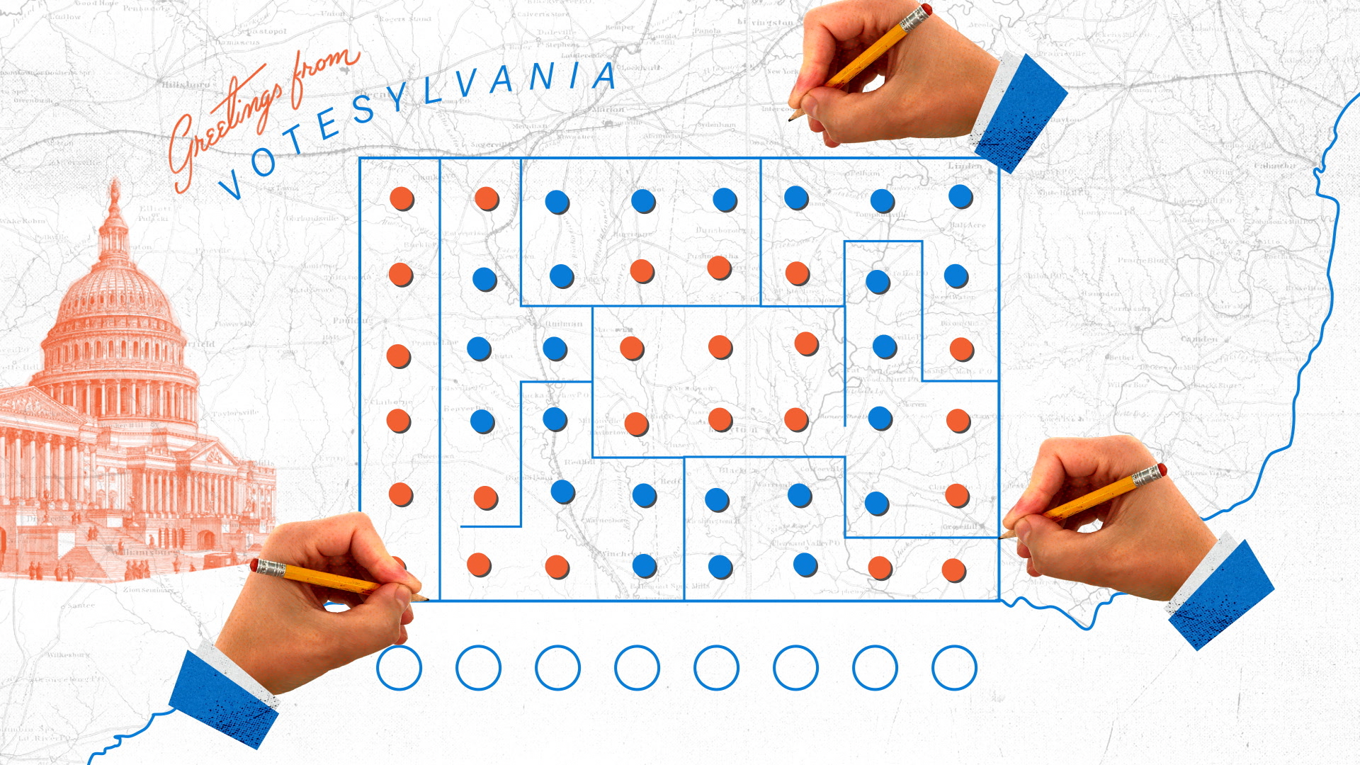
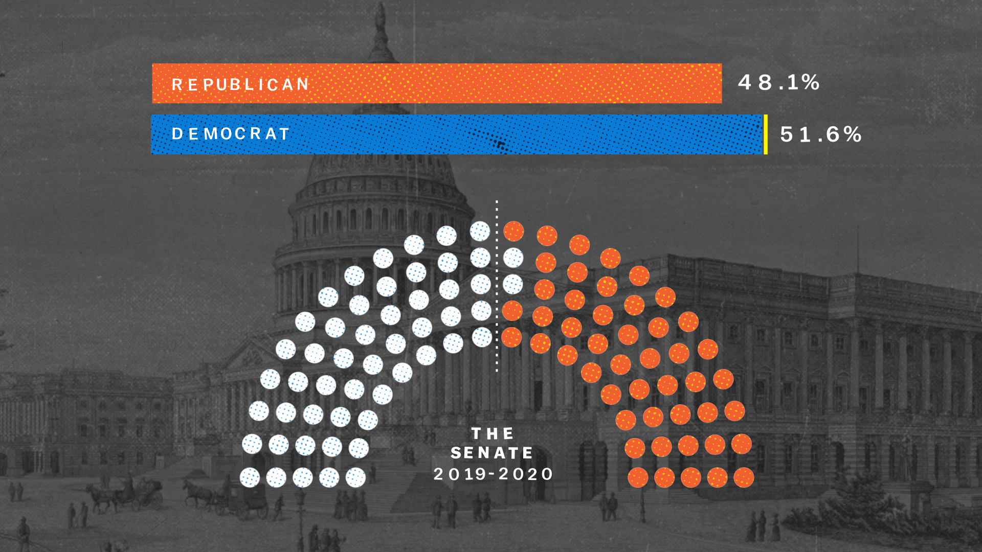
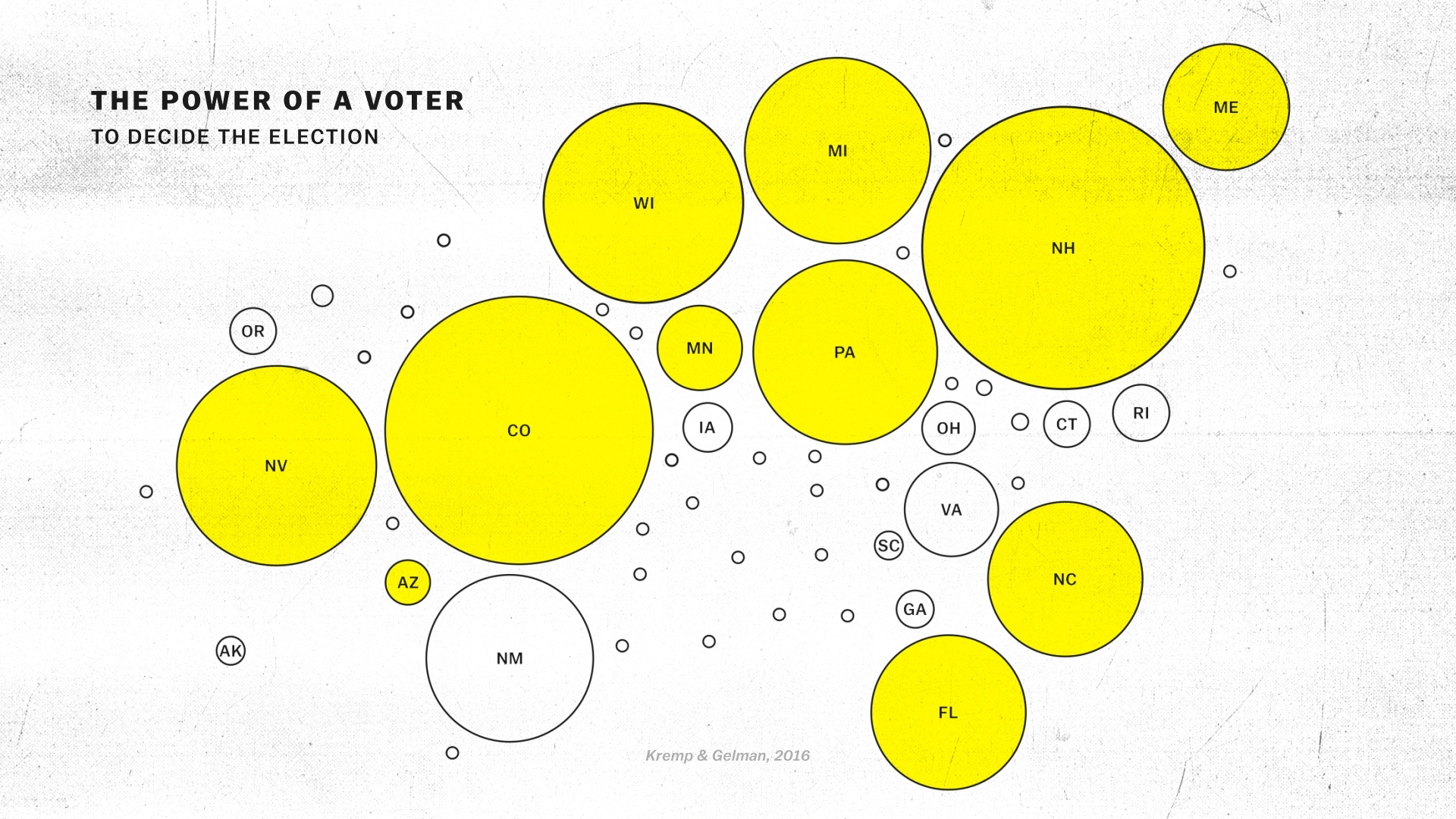
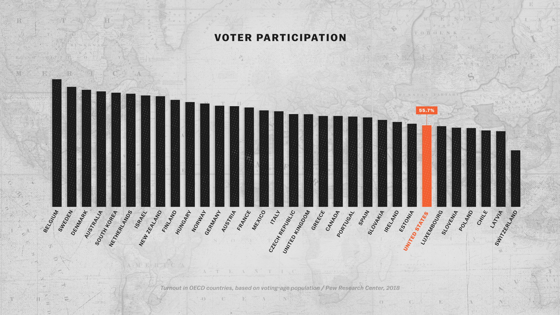
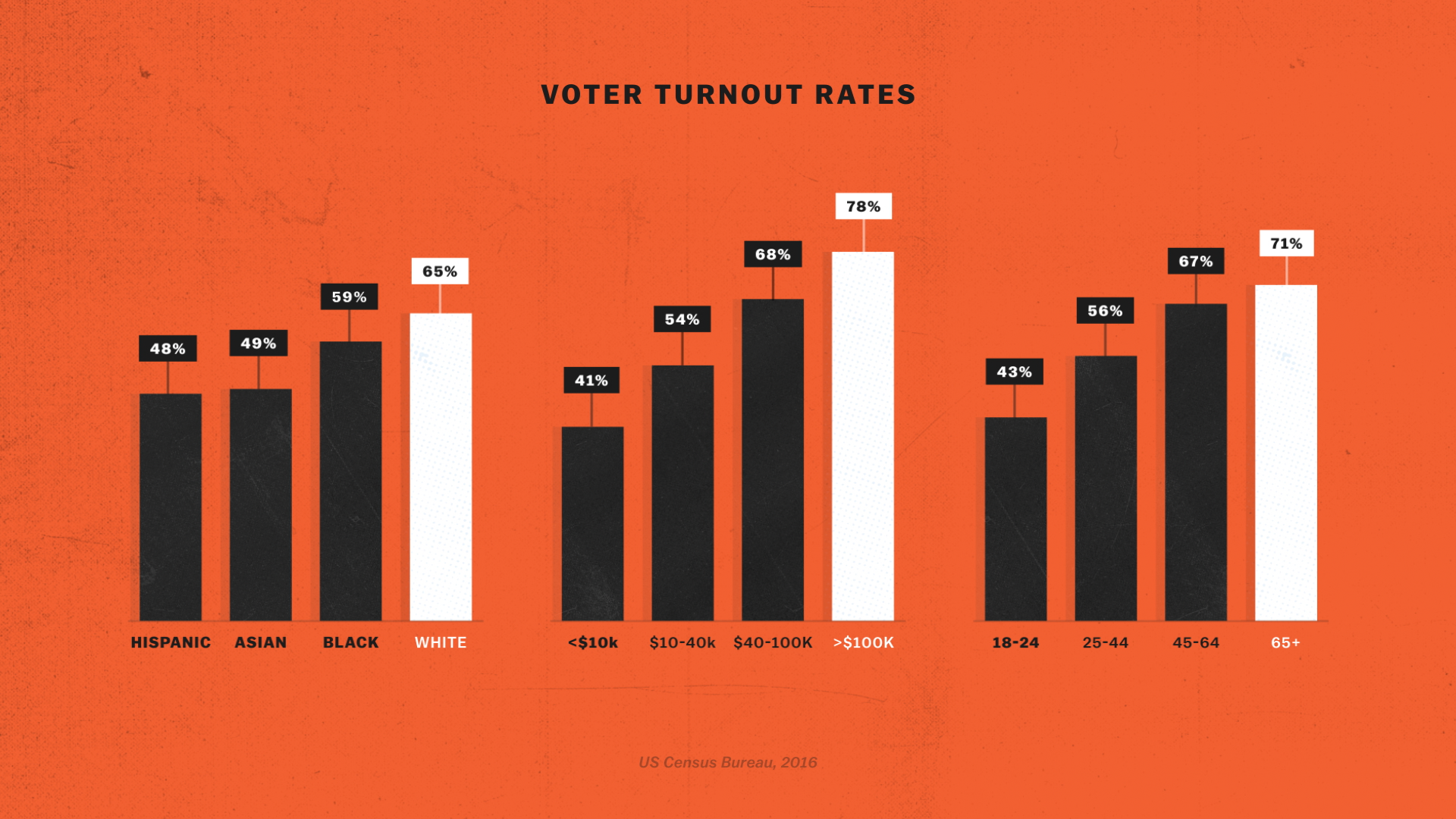
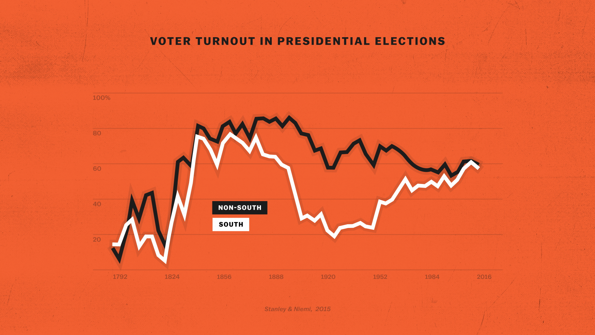
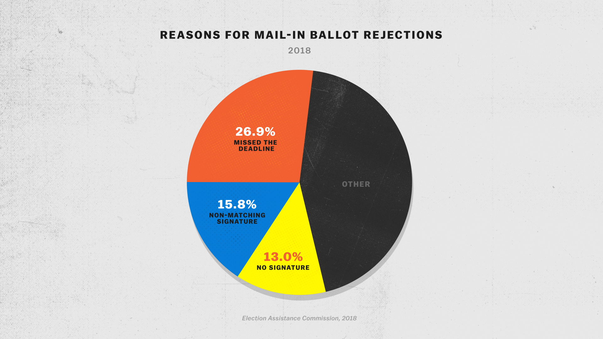
Spanning topics from Congressional representation to the history of voter enfranchisement, these episodes were a marathon sprint through the Summer of 2020, in which our entire team—many new faces—worked remotely together for the first time. This series featured more graphics (data in particular) than prior episodes. Some of these issues like campaign finance and gerrymandering were huge challenges to distill in a digestible, visual way, but that is the most fun part about working on Explained!
DIRECTION


My design vision for this series was built around two primary inspirations:
Dadaism: An anti-nationalist, activist art movement of the early 20th Century
Vintage US political design, from Roosevelt to Reagan. Campaign buttons became a key motif.
The collage style drew from historical Dadaists like Hannah Hoch to contemporary creators such as Mike McQuade. Our archival team worked overtime to help us source all the assets we needed—thank you guys!
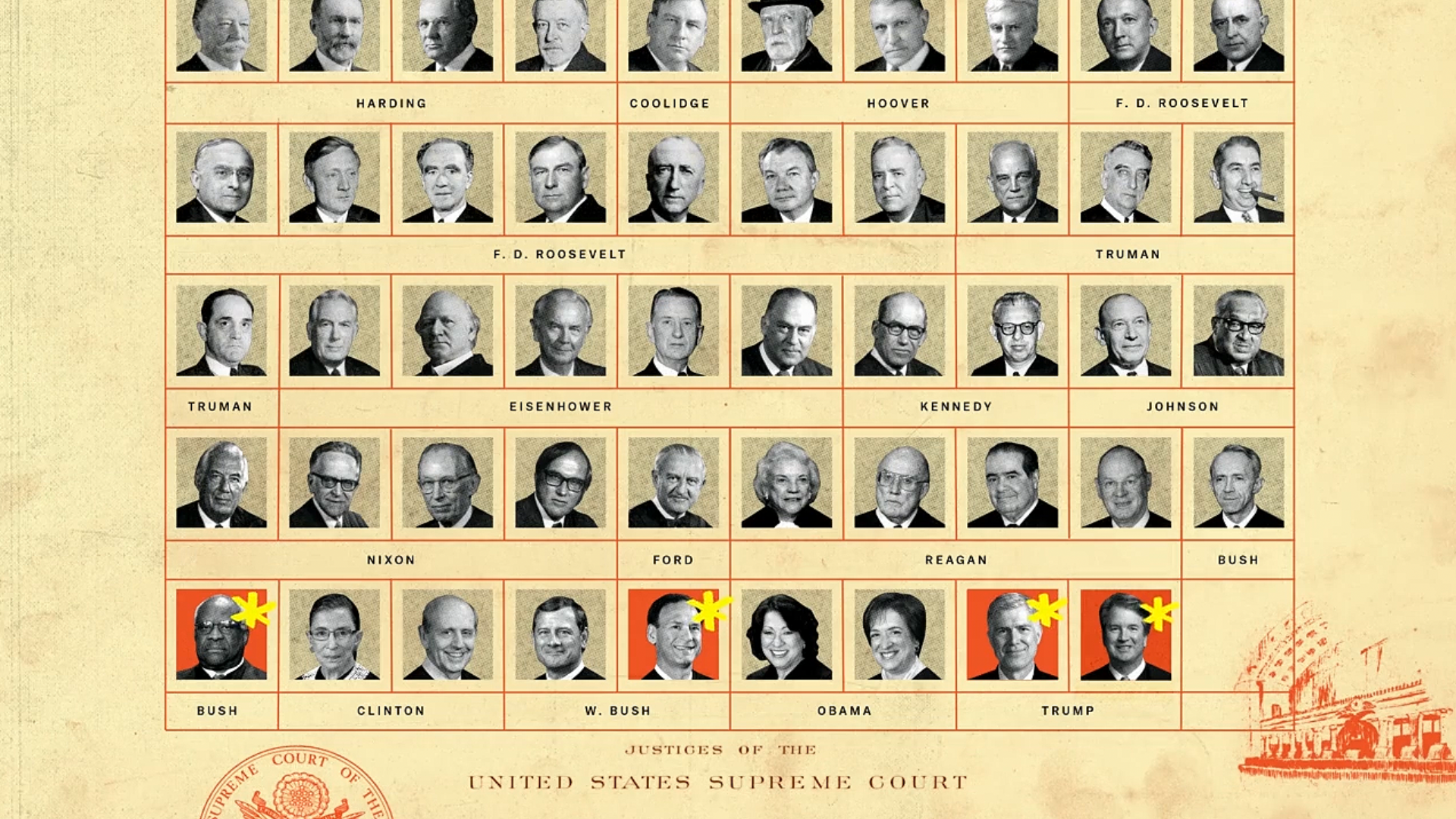
SELECTED STYLEFRAMES
I am so grateful to the incredible group of animators I got to work with on this series: Jackie Lay, Po-Chen Chia, Lynn Hwirin Park, and Annie Zhao. Andrew Garcia Phillips worked with our graphics team on achieving the incredible suite of complex data visuals.


